Clik here to view.
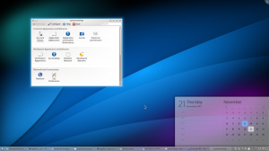
Plasma Desktop running on top of Qt 5 and KDE Frameworks 5
Exciting times. I am working on the lower-right corner of the desktop right now, and thought I could give a quick visual update of progress there, as well as some sense of direction where we’re heading, how the user interface evolves, Plasma’s new architecture, and underlying software stack and the device spectrum. A whole mouthful, so grab a cup of tea.
Two areas in particular are catching my attention these days, the notification area (“system tray”, that row of icons which show you the status of all kinds of things), and the clock with its calendar popup. The calendar shows quite nicely some things we want to pay attention to in Plasma 2: consistency and elegance. We are making more use of pronounced typography, are fixing alignment problems, and are looking for a generally more elegant way of presenting the common functionality. In that, the plan is not to make a lot of changes to the functionality itself, not cutting down the UI, but polishing what is already there. By reducing the workspace’s mental friction for the user makes the tools take a step back and give more room to the content and interaction that is presented. Doing that, the workspace should be functional, yet elegant. The migration should feel like an upgrade of something familiar. We want to make it functionality-wise equivalent, but more polished. On top of that, we’re readying the technology for future use cases, and evolution of the underlying technology stack.
Clik here to view.
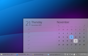
Calender popping up from the Plasma panel
QtQuick 2 actually makes these things a lot easier, as it is much more correct in terms of calculating font metrics reliably, which we need to (sub-)pixel-perfectly align text and other UI elements. Trying to make this exact in Qt4 and on top of QGraphicsView was a shortcut into madness. Ever so slightly off font metrics, and wonky layouts get you to tear your hair out pretty quicky. This is much better now, (though certainly not perfect in all areas), so it allows us to finally fix these jarring little mis-alignments that nag the eye. The calendar already does it pretty well, and serves as a nice example. This implementation takes the physical size of the pixel on the screen into account by correcting for DPI in the whole layout, so it works nicely on all resolutions and pixel densities. With higher pixel-density displays, the rendering gets more details, fonts look neater, but the size of interaction areas, and the effective size on the screen don’t change much. The screenshots have been taken on a 170 DPI display, so if the fonts seem huge on your display (or small, as I hope for you), this would be the reason for that.
Clik here to view.
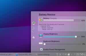
Battery Monitor
In the notification area, you might notice that the widgets that have been living in there are now contained in the same popup. This results in less window management and layering of small popups in the notification area, clearer navigation and a cleaner look. The currently active icon has slightly pronounced visuals compared to the others.
The calendar will of course show information about tasks and agenda (this part doesn’t work yet). One neat thing which the new architecture allowed use to do very easily is lazy-loading the calendar. As just loading the calendar can result in quite a bit of loading underneath, delaying to loading it on-demand speeds up start-up time and lowers memory consumption in a lot of cases.
Below the surface, the changes are more radical. Qt5 and with it the move to QtQuick 2, the scenegraph-based successor to QtQuick 1, a new QML and javascript engine which is smaller and more optimized for Qt data types and conventions than V8, new sandboxing features, being able to render and composite pretty much entirely on the graphics card, share textures between compositor and workspace shell, addition of Wayland as a fully supported target platform, and along with all that new input and security features.
Clik here to view.
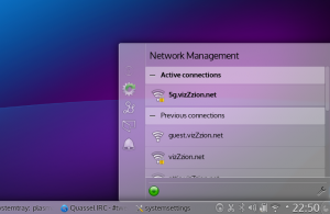
Network Management in the notification area
Plasma 2 is a converging user interface. It allows to control the Look and Feel at different levels. On the lower level / higher detail side of the scale, we look at adjusting input areas, sizing of ui elements, and interaction schemes by swapping out and “overriding” parts of the UI toolkit with, for example, touch friendly versions of widgets. On a higher level, we support laying out the furniture of the workspace (think of alt+tab window switcher, log in, lock, etc. features) by more code sharing and a different logic to how they’re loaded (and swapped out). Plasma shell allows dynamic switching of shell layouts at run-time. The shell is equipped to morph between workspace presentations, so should your tablet suddenly get a keyboard and mouse plugged in, it changes its disguise to a traditional (actually your own customized) desktop layout. While this is cool, in reverse, it allows us to isolate changes that are done to suit other devices from the “Desktop Experience”. Just because the workspace support multiple devices, the user doesn’t get the lowest common denominator, but specialization. Different devices are different for a reason, and so should the UI be. “Mobile-friendly” shouldn’t mean “misses features”, but “responsibly designed” (excuse the pun).
Our tricks allow to use the same system on a range of devices, with the user interface adopting to specialties of hardware it runs on, such as input, display, but also usage scenarios specific that device. Much like the Linux kernel, which “mostly figures out how to run properly in a device it’s booted on”, and which can be configured as small and as big as one wants, the user-interface uses “UI plugins” at different layers, and detects changes and adopts to the form factor. You use a media center “driver” if you want to use it on the TV in your living room, you use a tablet “driver” on your tablet on the go, you use desktop driver on the laptop, and you can switch the device’s UI when needed. Laptop or tablet + HDMI cable ~= media center, isn’t it?
Clik here to view.
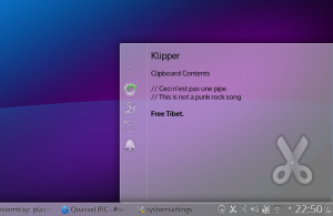
Clipboard interaction
You see, many different construction sites. We’re working a lot on all these things and you should definitely consider joining. Nothing is set in stone yet, and you should consider the imagery functional mock-ups, rather than the final thing. It’s not perfect and lacking in all kinds of places, it even crashes in some and what is presented is just a snapshot of work in progress. Many details remain to be hashed out. Still, I’m running Plasma 2 about half of the time on my laptop now. It’s just about to be becoming usable and almost dogfoodable for more than just a very small handful of people with an elevated pain threshold and a debugger at hand.
“When?”, I hear you ask. We’re aiming at a stable, end-user ready release of the new Desktop shell in summer 2014, at the end of Q2. On of the next milestones will be a tech-preview, which is planned for mid-December, so just about a month away from today. From December, where we’ll reach the point of having the basic functionality in place, we’ll spend time on filling in the missing bits, making sure everything runs on Wayland, and on polishing and quality improvements. Integrating additional workspaces, such as Plasma Active and Plasma MediaCenter are also next year’s roadmap. These will become the tablet, resp. media center drivers.